Written by OSEA Staff | Published March 1, 2024
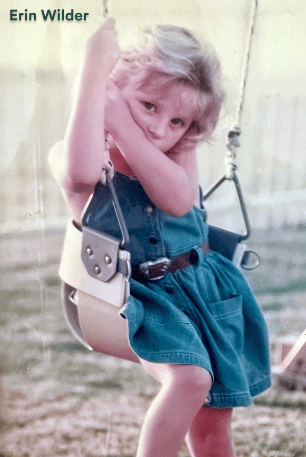
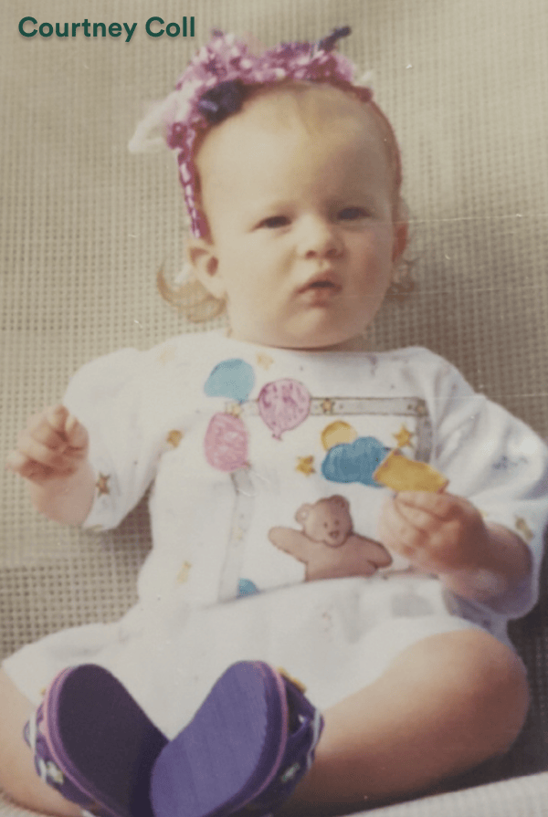
An interview with Erin Wilder, OSEA’s Web Developer and Courtney Coll, OSEA’s Creative Director.


What inspired OSEA to create a 90s website for their Leap Year campaign?
We always do a big blowout for Leap Year so I wasn’t surprised when Sam, our SVP of E-commerce, asked me to do a special site for this year’s promotion. The inspiration is really that we only do this every 4 years and OSEA launched during a Leap Year, so let’s go big. At our CEO’s request, I went wild with it.
-ERIN WILDER
What went into creating a 90s website?
The first step was to gather all the 90s nostalgia I could from the internet as inspiration. I spent a lot of time on the Internet Archive, an amazing non-profit organization that preserves historical versions of the web. I also spent a lot of time on neocities, an evolution of the popular 90s web hosting platform geocities. I took a lot of inspiration from the UI of Windows 95 as well.
Fortunately many of the features that used to be common on the web are still available today, lovingly preserved by our fellow fans of the 90s. Things like hit counters, guestbooks, and chat boxes. Using all these sources of inspiration I came up with a list of the essential elements of a great 90s site. These include: bright neons, gratuitous gifs and motion elements, 3D effects, loud background patterns, music and sound effects, and handwritten fonts. I then brought all these elements together using a traditional table layout with 3D borders and I was almost there.
For the final touches I did a deep dive into my past (and my amazing team’s past). When I was a teenager, I was just learning how to code for the first time. Back then we thought of websites like visiting someone’s bedroom–full of flair, personality and individuality. I found an old Dollz Maker tool that I loved playing with online, grabbed images of Beanie Babies, Tamagotchi, and Lava Lamps, and worked that into the design with a sticker bank feature, inspired by my obsession with stickers as a kid in the 90s. I finally finished the whole thing off with some amazing photography of Jenefer and Melissa–OSEA’s mother and daughter founders–from the 90s.
-ERIN WILDER
What’s your favorite part of the campaign?
My favorite part of the campaign was collaborating with all team members and coming together to brainstorm what they remember and miss from the 90s. I love colors and patterns so this was such a fun project to break away from what we usually create and just go wild with all the designs. Michelle, our Design Director, really led the design team by implementing texts from the 90s, along with bright pops of color!!
-COURTNEY COLL
Walk us through the creative process behind designing and developing a 90s-inspired website?
The most important part of the creative process for me was bringing in the elements of the 90s we all know and love. Nods to the clip-art style iconography of Windows, details that include the cultural phenomena of the time like Beanie Babies, and a fearless, in-your-face style. The most difficult part was actually allowing myself to be free enough to break the design rules we hold so dear as modern web designers and developers while still keeping the site usable. In the end it was an incredibly liberating and fun creative process, full of “back to the drawing board” moments and a lot of laughing with my teammates as we reminisced about all the things we remember from those days on the web.
-ERIN WILDER
What are your favorite 90s features of the website?
The sticker bank is a favorite for sure, because it allowed me to integrate so many fun 90s elements into the site with one simple interface. I also love the 3D effects that were so popular back then and used them on all the buttons and borders. I also love the gifs and animations sprinkled throughout the homepage.
-ERIN WILDER
Tell us about the 1996 crewneck!
The classic crewneck was inspired by old graphic tees from the 90s–we wanted to tap into the beach vibes but also keep it classic and fun!!!
-COURTNEY COLL
Do we really have to wait four more years to see this again?
We are all wondering the same thing ;)
-COURTNEY COLL
 Body Oil
 Body Moisturizers
 Cleansers
 Body Scrubs
 Face Moisturizers
 Travel & Sets
